Logo Redesign
Overview
Role
UI
Graphic Design
Front End Development
Client
GT's Center for Health Analytics and Informatics
Tools
Adobe Illustrator
Procreate
Wordpress
Duration
Fall 2021
Background
A part of my Graphic Design and Communications internship with CHAI, one of our projects was to undertake the redesign of the CHAI brand itself. This involved developing graphics centered around the core ideas of CHAI as well as revitalizing an already existing website.
Mission Statement
CHAI's mission is an important one- "to improve human health and medical research through innovations in the capture, analysis, and delivery of data to healthcare stakeholders." My counterpart and I's personal goal for this project was to take that message and embody it in a design that stands apart from other Georgia Tech research divisions while upholding the proud GT standard of excellence.
Graphic Design & Illustration


Inspiration and Sketches
The first step in any good design process, we turned to brainstorming and mood boarding. The sketches you see above are just a few of the many many we produced before narrowing down the design. We wanted users to feel warm and full of interest for the wonderful things the team at CHAI was doing. Thus, we pulled images and colors that conveyed those feelings.
Logo Iterations
We decided that in order to help CHAI stand out from the crowd, we would focus on the other meaning of
chai: tea. By leaning into the playfulness of the name, we were able to focus on combining iconography of tea with data and technology driven motifs. This process took on a variety of different forms. From a tea bag shaped like a sim card to tea being steeped in a beaker, I thought outside the box.


Rough Draft Logos
Graphic Elements and Final Logos
The graphic elements we picked were reflections of the data that CHAI worked with. All reflecting "data" in its various forms, these graphics are used throughout the website and more in order to highlight the stem nature of CHAI and also subtly connect it to our other project OMOPonFHIR. The final logos combined round shapes (representing connection: human and computer) with a more subtle combination of tea and STEM.

Sub Logo


Main Logo

Illustrative Elements
Icons and Illustrations
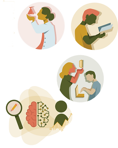
In order to better represent the humanness of CHAI as well as its reach within and outside the GT community, I developed a series of illustrations and icons for this project. These illustrations are used in the website redesign as well as for any future need such as print or social media. Additionally, the icons represent key CHAI terms such as health, user experience, data security, and connection.

CHAI Icons
UI Design - Prototype

Walking Through the Site
This website build was an interesting challenge, as we needed to build it on the backs of a preexisting website. Developed primarily through Wordpress with a touch of custom css and javascript, this website's purpose is to give a better understand of CHAI and its mission. Additionally, it acts as a map of sorts to see CHAI's projects. Although we weren't able to launch the website before concluding the internship, the walk though above gives a good insight into what the finished product would resemble.
Reflections
My Musings
This project helped to grow my skills both technically and also logistically. Involved in this project, which the design work does not show, was the constant back and forth between my partner, myself, our boss, and the wider CHAI team. Explicit communication is the key to developing and produce effective design work, and I enjoyed the team effort it took to build this redesign. Future revisions of the design and website might include an expanded project section as well as additions of video tutorials and learning materials.

